# pro-components **Repository Path**: ijs/pro-components ## Basic Information - **Project Name**: pro-components - **Description**: No description available - **Primary Language**: Unknown - **License**: MIT - **Default Branch**: master - **Homepage**: None - **GVP Project**: No ## Statistics - **Stars**: 0 - **Forks**: 0 - **Created**: 2024-09-10 - **Last Updated**: 2024-09-10 ## Categories & Tags **Categories**: Uncategorized **Tags**: None ## README

ProComponents

Designed for Enterprise-Level Application, Use Ant Design like a Pro! [![][npm-release-shield]][npm-release-link] [![][npm-downloads-shield]][npm-downloads-link] [![][github-releasedate-shield]][github-releasedate-link] [![][github-action-build-shield]][github-action-build-link] [![][codecov-shield]][codecov-link]
[![][github-contributors-shield]][github-contributors-link] [![][github-forks-shield]][github-forks-link] [![][github-stars-shield]][github-stars-link] [![][github-issues-shield]][github-issues-link] [![][github-license-shield]][github-license-link]
[![][ant-design-shield]][ant-design-link] [![][devops-dumi-shield]][devops-dumi-link] [![][devops-father-shield]][devops-father-link] English · [简体中文](./README.zh-CN.md) · [Report Bug][github-issues-link] · [Request Feature][github-issues-link] ![](https://gw.alipayobjects.com/zos/kitchen/OsP5rUT6tc/pro-components.webp)
Table of contents #### TOC - [📦 Installation](#-installation) - [✨ Features](#-features) - [Empowering Features of ProComponents](#empowering-features-of-procomponents) - [Considerations and Limitations](#considerations-and-limitations) - [🖥 Browser compatibility](#-browser-compatibility) - [⌨️ Local Development](#️-local-development) - [🤝 Contributing](#-contributing) - [🛣️ Ecosystem](#️-ecosystem) ####
## 📦 Installation To install `@ant-design/pro-components`, run the following command: ```bash $ pnpm install @ant-design/pro-components ```
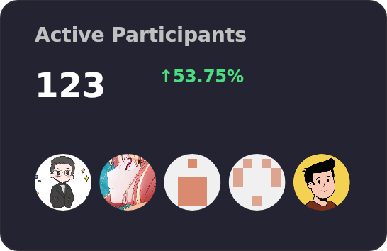
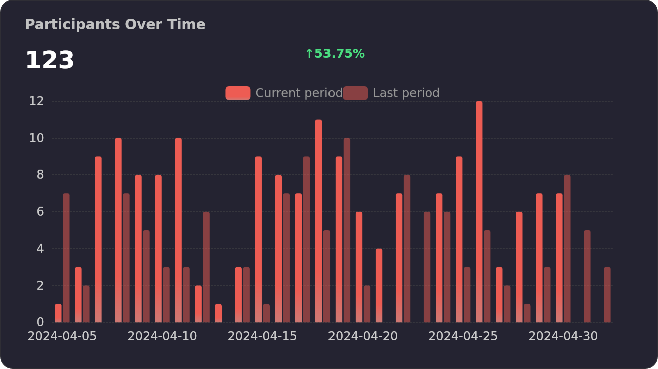
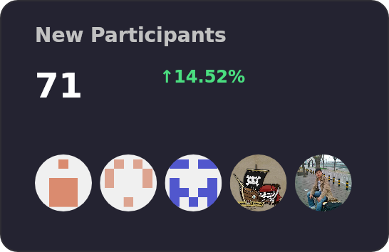
## ✨ Features Pro Series components are meticulously engineered to bolster the robust architecture of enterprise-grade applications. [![](https://next.ossinsight.io/widgets/official/compose-activity-trends/thumbnail.png?repo_id=183895098&image_size=auto&color_scheme=dark)](https://next.ossinsight.io/widgets/official/compose-activity-trends?repo_id=183895098)
### Empowering Features of ProComponents > \[!NOTE] > > ProComponents stands as a beacon for React-based enterprise application development. Here’s what makes it exceptional: - 💡 **Extensive Component Suite**: ProComponents boasts a comprehensive array of UI elements—ranging from tables and forms to charts and tree views. It caters to the diverse needs of enterprise applications with finesse. - 🚀 **Advanced Functionality**: Beyond basic UI elements, ProComponents is equipped with sophisticated data handling and business logic capabilities, enabling developers to swiftly construct powerful enterprise solutions. - 🎯 **Intuitive Usage**: With its straightforward API and detailed documentation, ProComponents ensures a smooth onboarding experience for developers, fostering quick adoption and deployment. - 🎨 **Visual Configuration Tools**: Certain components within ProComponents benefit from visual configuration aids, streamlining the design process for developers by simplifying component setup. - 🛠️ **Unmatched Customizability**: The library accommodates a plethora of configurations and styling options, ensuring that ProComponents can be tailored to the unique demands of any project. In essence, ProComponents is a robust, user-friendly, and versatile UI component library, architected to empower applications across various scales and domains.
### Considerations and Limitations > \[!WARNING] > > While ProComponents offers a wealth of benefits, it’s important to weigh certain considerations: - **Limited customization**: Despite its rich component repository, ProComponents may pose challenges when it comes to deeply personalized customizations, potentially hindering the realization of certain project visions. - **Learning curve**: The library’s comprehensive API and extensive documentation, while thorough, may initially overwhelm newcomers. Mastery of ProComponents might require a dedicated learning investment. - **Browser compatibility**: ProComponents leverages cutting-edge browser technologies, which may not be supported by older browsers, potentially restricting application accessibility and necessitating additional development efforts for broader compatibility. - **Codebase size**: The substantial size of ProComponents’ codebase could impact the agility of the development process and complicate long-term maintenance. > \[!TIP] > > To summarize, ProComponents is a formidable contender in the realm of enterprise application UI libraries, yet it comes with its own set of trade-offs, including customization constraints, a considerable learning curve, browser compatibility considerations, and a sizable codebase. Developers are advised to thoroughly assess their project needs and limitations prior to integrating ProComponents into their workflow.
## 🖥 Browser compatibility > \[!NOTE] > > - Modern browsers and Internet Explorer 11 (with [polyfills](https://stackoverflow.com/questions/57020976/polyfills-in-2019-for-ie11)) > - [Electron](https://www.electronjs.org/) | [![edge](https://raw.githubusercontent.com/alrra/browser-logos/master/src/edge/edge_48x48.png)](http://godban.github.io/browsers-support-badges/) | [![Edge](https://raw.githubusercontent.com/alrra/browser-logos/master/src/firefox/firefox_48x48.png)](http://godban.github.io/browsers-support-badges/) | [![chrome](https://raw.githubusercontent.com/alrra/browser-logos/master/src/chrome/chrome_48x48.png)](http://godban.github.io/browsers-support-badges/) | [![safari](https://raw.githubusercontent.com/alrra/browser-logos/master/src/safari/safari_48x48.png)](http://godban.github.io/browsers-support-badges/) | [![electron_48x48](https://raw.githubusercontent.com/alrra/browser-logos/master/src/electron/electron_48x48.png)](http://godban.github.io/browsers-support-badges/) | | --- | --- | --- | --- | --- | | Edge | last 2 versions | last 2 versions | last 2 versions | last 2 versions |
## ⌨️ Local Development You can use Github Codespaces for online development: [![][github-codespace-shield]][github-codespace-link] Or clone it for local development: ```bash $ git clone https://github.com/ant-design/pro-components.git $ cd pro-components $ pnpm install $ pnpm dev ```
## 🤝 Contributing > \[!IMPORTANT] > > Join our collaborative ecosystem. Your contributions are the heartbeat of our project. Here's how you can be an integral part of our vibrant community: - **Integrate and Innovate**: Incorporate Ant Design Pro, umi, and ProComponents into your projects. Your real-world usage and feedback are invaluable to us. - **Voice Your Insights**: Encounter a glitch? Have a query? Your perspectives matter. Share them by submitting [issues][github-issues-link] and help us enhance the user experience. - **Shape the Future**: Have code enhancements or feature ideas? We invite you to propose [pull requests][pr-welcome-link] and contribute directly to the evolution of our codebase. Every contribution, big or small, is celebrated. Join us in our mission to refine and elevate the world of open-source enterprise UI components. 😃 [![][pr-welcome-shield]][pr-welcome-link]


## 🛣️ Ecosystem - **[ProComponents](https://github.com/ant-design/pro-components)** - Designed for Enterprise-Level Application, Use Ant Design like a Pro!. - **[ProEditor](https://github.com/ant-design/pro-editor)** - The Ultimate Editor UI Framework and Components. - **[ProFlow](https://github.com/ant-design/pro-flow)** - A Flow Editor Framework base on React-Flow. - **[ProChat](https://github.com/ant-design/pro-chat)** - Components Library for Quickly Building LLM Chat Interfaces.
--- #### 📝 License Copyright © 2023 - present [AFX][ant-design-link] & [Ant Digital](https://antdigital.com).
This project is [MIT](./LICENSE) licensed. [ant-design-link]: https://ant.design [ant-design-shield]: https://img.shields.io/badge/-Ant%20Design-1677FF?labelColor=black&logo=antdesign&style=flat-square [codecov-link]: https://codecov.io/gh/ant-design/pro-components [codecov-shield]: https://img.shields.io/codecov/c/github/ant-design/pro-components?color=1677FF&labelColor=black&style=flat-square&logo=codecov&logoColor=white [devops-dumi-link]: https://d.umijs.org/ [devops-dumi-shield]: https://img.shields.io/badge/docs%20by-dumi-blue?color=1677FF&labelColor=black&style=flat-square [devops-father-link]: https://github.com/umijs/father [devops-father-shield]: https://img.shields.io/badge/build%20with-father-028fe4.svg?color=1677FF&labelColor=black&style=flat-square [github-action-build-link]: https://github.com/ant-design/pro-components/actions/workflows/build.yml [github-action-build-shield]: https://img.shields.io/github/actions/workflow/status/ant-design/pro-components/build.yml?color=1677FF&label=build&labelColor=black&logo=githubactions&logoColor=white&style=flat-square [github-codespace-link]: https://codespaces.new/ant-design/pro-components [github-codespace-shield]: https://github.com/codespaces/badge.svg [github-contributors-link]: https://github.com/ant-design/pro-components/graphs/contributors [github-contributors-shield]: https://img.shields.io/github/contributors/ant-design/pro-components?color=1677FF&labelColor=black&style=flat-square [github-forks-link]: https://github.com/ant-design/pro-components/network/members [github-forks-shield]: https://img.shields.io/github/forks/ant-design/pro-components?color=1677FF&labelColor=black&style=flat-square [github-issues-link]: https://github.com/ant-design/pro-components/issues [github-issues-shield]: https://img.shields.io/github/issues/ant-design/pro-components?color=1677FF&labelColor=black&style=flat-square [github-license-link]: https://github.com/ant-design/pro-components/blob/master/LICENSE [github-license-shield]: https://img.shields.io/github/license/ant-design/pro-components?color=1677FF&labelColor=black&style=flat-square [github-releasedate-link]: https://github.com/ant-design/pro-components/releases [github-releasedate-shield]: https://img.shields.io/github/release-date/ant-design/pro-components?color=1677FF&labelColor=black&style=flat-square [github-stars-link]: https://github.com/ant-design/pro-components/network/stargazers [github-stars-shield]: https://img.shields.io/github/stars/ant-design/pro-components?color=1677FF&labelColor=black&style=flat-square [npm-downloads-link]: https://www.npmjs.com/package/@ant-design/pro-components [npm-downloads-shield]: https://img.shields.io/npm/dt/@ant-design/pro-components?labelColor=black&style=flat-square&color=1677FF [npm-release-link]: https://www.npmjs.com/package/@ant-design/pro-components [npm-release-shield]: https://img.shields.io/npm/v/@ant-design/pro-components?color=1677FF&labelColor=black&logo=npm&logoColor=white&style=flat-square [pr-welcome-link]: https://github.com/ant-design/pro-components/pulls [pr-welcome-shield]: https://img.shields.io/badge/%E2%9D%A4%EF%B8%8F%20PR%20WELCOME-%E2%86%92-1677FF?labelColor=black&style=for-the-badge ## Star History [![Star History](https://api.lucabubi.me/chart?username=ant-design&repository=pro-components)](https://github.com/lucabubi/star-history)